Syntheq
About the project
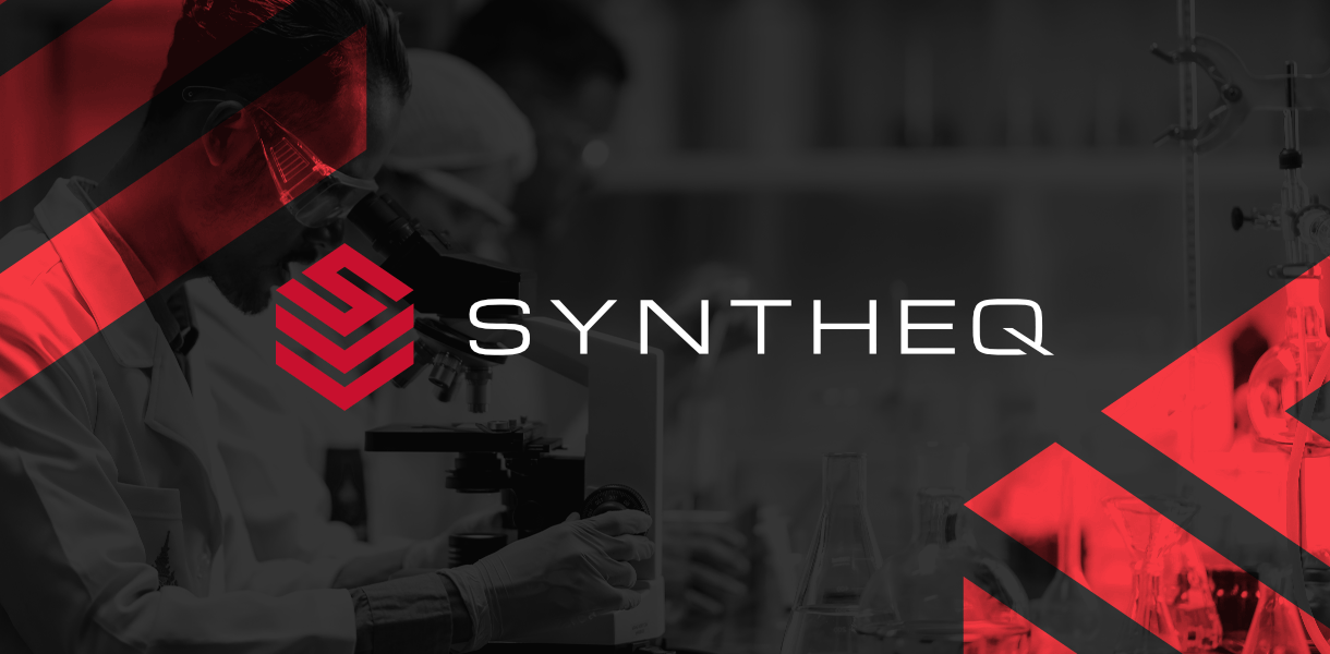
The main design idea behind the Syntheq logotype was to capture the specifics of the brand's business in as simple a form as possible. The minimalist form of the logotype was to ensure both excellent readability and the ability to engrave on manufactured laboratory equipment.
Typografia została oparta na bazie wersalików fontu Michroma z zastosowaniem alternatywnego kerningu oraz poddaną stylizacji literą Q. Zabieg miał na celu uproszczenie napisu oraz nadanie mu bardziej futurystycznej i profesjonalnej formy.
![]()
The signet consists of an embedded first letter of the name on an axonometric "stack" referring to the EQ (equipment) affix. The flat view is inspired by military symbolism, which refers to the character of the business.
